Plot the data
A table of numbers is not information, it is data. It is information that we need to make decisions, to notice differences and to detect patterns. It is a plot of the data that is often all that we need to interpret the data.
One of my first jobs in industry was with a plant manager that insisted we “Speak with data!”. Any proposal or report had to include the data and it told the story. No data, no story, no approval.
A Data Example
Let’s work an example and see how even simple plots can help us find the story the data wants to tell.
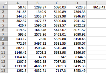
Here’s some data from a piece of equipment. When it fails a technician responds and repairs the equipment. The data is the time of the failure report in hours from the start of the year. Thus, 58.45 hours is a little over two days since the start of the year.
Here’s a screen shot of the data in a spreadsheet. All data is in hours.
Even studying the table of numbers doesn’t help reveal the story within the 61 pieces of data. We do know that there are about 2 failures per month on average. There seems to be groups of failures, and a few stretches without failures.
First Plot of the Data
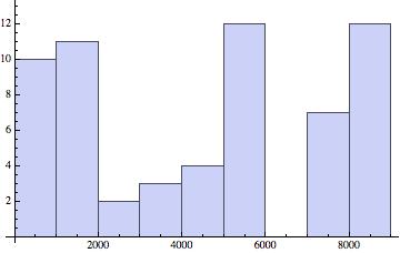
A good first plot for any dataset is a Histogram. It may reveal a pattern or part of story.
Since the data was collected over a year, I created the first plot with 12 bins which will roughly break down the failure data into month-long buckets.
No obvious pattern.We might need more data going back a few years, or possibly plotting time between failures would be more revealing. It’s easy to experiment and quickly detect if any explainable pattern exists.
A Mean Cumulative Function Plot
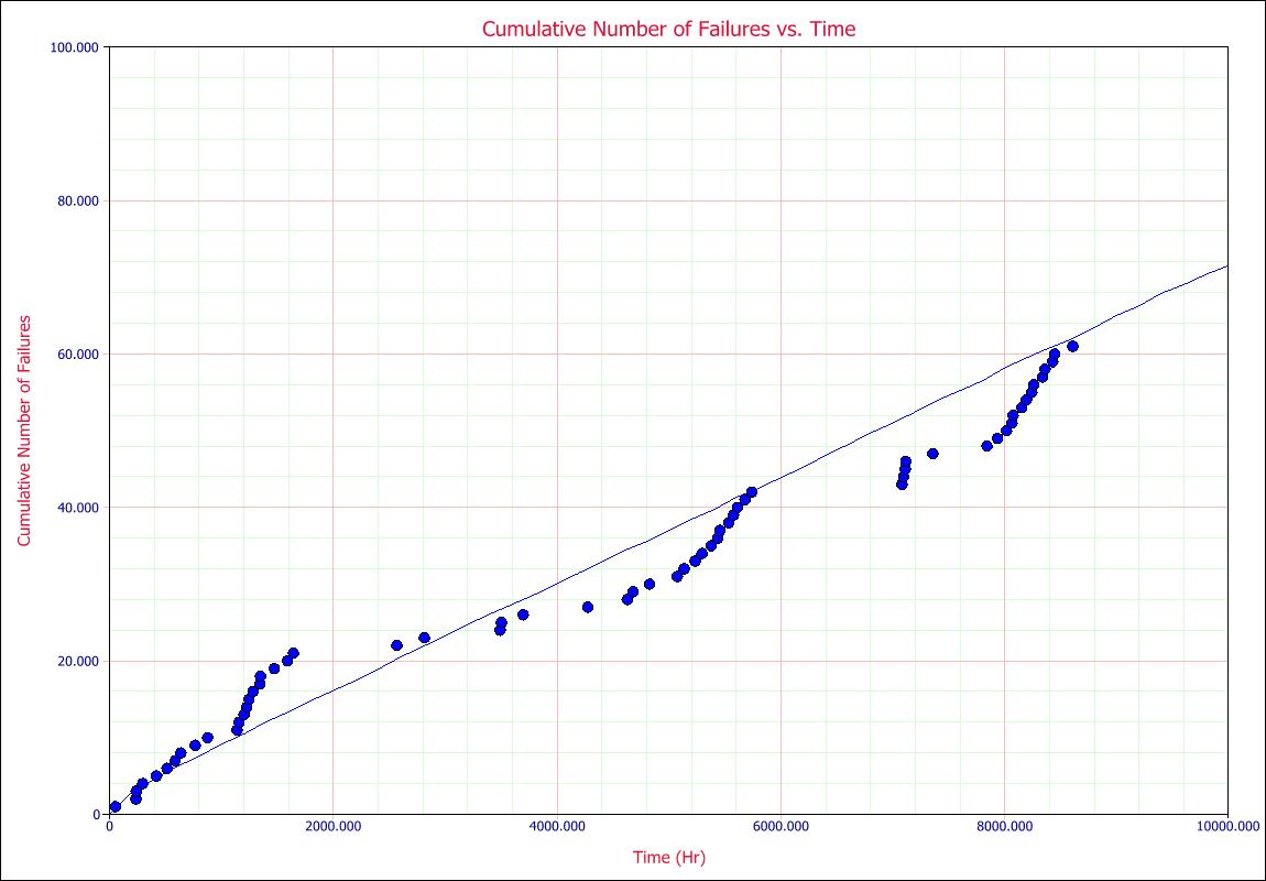
Since the data is from a single repairable unit, I’ll try a mean cumulative function plot. It is a plot of time in hours versus the count of failures to date. With each failure the vertical position of the plotted point is incremented up by one.
Now, this is interesting. What are those groups of failures and what happened to cause a long period without failures? Are the repairs helping or hurting the reliability of the system?
These questions come from the plot of the data. This is the start of the story.
With a few queries, we learned that the clusters of failures are commonly a string of no trouble found. The technician did a quick visual inspected, started the equipment and moved on to the next project. After a string of maybe 10 no trouble founds a relatively major repair would take place. In two of the instances the equipment was down for a couple of weeks (hence no failures showing over an extended period.)
Summary
Tracking a grand average of downtime or number of failures per month did not reveal much information. The mean cumulative function plot caused us to ask a few questions, to look at specific repair logs, and to explore why the pattern we see happens.
Looking at a table of numbers or a log sheet of repair notes is a very difficult way to determine what is happening. A simple plot is often all that is needed to hear what the data has to say.
Plot the data a few different ways. Learn to hear what the data has to say. Find the questions that may lead you to making reliability improvements.


