Plot the Data
Just, please, plot the data.
If you have gathered some time to failure data. You have the breakdown dates for a piece of equipment. You review your car maintenance records and notes the dates of repairs. You may have some data from field returns. You have a group of numbers and you need to make some sense of it.
Take the average
That seems like a great first step. Let’s just summarize the data in some fashion. So, let’s day I have the number of hours each fan motor ran before failure. I can tally up the hours, TT, and divide by the number of failures, r. This is the mean time to failure.
$latex \displaystyle&s=3 \theta =\frac{TT}{r}$
Or, if the data was one my car and I have the days between failures, I can also tally up the time, TT, and divide by the number of repairs, r. Same formula and we call the result, the mean time between failure.
And I have a number. Say it’s 34,860 hours MTBF. What does that mean (no pun intended) other than on average my car operated for 34k hours between failures. Sometimes more, sometimes less.
Any pattern? Is my car getting better with age, or worse?
A Histogram
In school we used to use histograms to display the data. Let’s try that. Here’s an example plot.
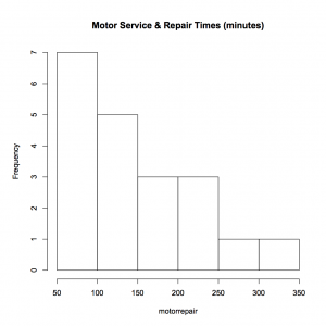 In this case the plot is of service and repair times (most likely similar to the times the garage has my car for a oil change and tune up). Right away we see more than just a number. The values range from about 50 up to about 350 with most of the data on the lower side. Just a couple of service times take over 250 minutes.
Using just an average doesn’t provide very much information compared to a histogram.
Mean Cumulative Function Plot
Over time count the number of failures. If the repair time is short compared to operating time, than this simple plot may reveal interesting patterns that a histogram cannot.
Here is a piece of equipment and each dot represented a call for service. The x-axis is time and the vertical axis is the count of service calls. While it’s not clear what happened shortly after about 3,000 hours, it may be worth learning more about what was going on then.

Even after the first there or four point after 3,000 hours would have signaled something different is happening here.
MCF plots show when something is getting worse (more frequent repairs) by curving upward, or getting better, (longer spans between repairs) by flattening out. Again, a lot more information than with just a number.
Plot the Fitted Distribution
Let’s say we really want to assume the data is from an exponential distribution. We can happily calculate the MTBF value and continue with the day. Or, we can plot the data and the fitted exponential distribution.
Let’s say we have about five failure times based on customer returns out of the 100 units placed into service. We can calculate the MTBF value including the time the remaining 95 units operated, which is about 172,572 hours MTBF. And, we can plot the data, too.
Here’s an example. What do you notice, even with a fuzzy plot image?

The line intersects the point where the F(t) is 0.63 or about the 63rd percentile of the distribution, and the time is at the point we calculated as the MTBF value (off to the right of the plot area).
Like me, you may notice the line doesn’t seem to describe the data very well. It seems to have a different pattern than that described by the exponential distribution. Let’s add a fit of a Weibull distribution that also was fit to the data, including the units that have not failed.

The Weibull fit at least appears to represent the pattern of the failures. The slope is much steeper than the exponential fit. The Weibull tells a different story. A story that represents the story within the data.
Again, just plot the data. Let the data show you what it has to say. What does your data say today?